As someone who loves interior design, there is something I have noticed over time. There are certain design elements that you will keep coming back to again and again. It could be wallpaper, some type of flooring, a piece of furniture, or, in this case, a paint color.
For years, I've been constantly going back to some kind of light blue paint color. I wanted to use it as a primary color in many rooms, both in this house and my home ex, but it has not yet borne fruit. Lately, I've noticed it more and more in designs that I love.
Today I'm sharing why I was drawn to this light blue paint color, where I thought of using it, and where I might use it on our home in the future.
Why am I so drawn to this light blue
I remember one of the first times (but not *first*) I picked this light blue paint color. The year was 2019. The color was in a kitchen filled with honey oak accents, featured in architectural digest. The way honey oak and blue paired together felt unique and timeless. Seeing it in this context gave me a heartfelt feeling and I immediately knew I wanted to use it in my own design. (Note: Upon further examination of the original article, it turns out that the cabinet color is actually gray, even though it looks blue to me in the photo below!)
When I dig a little deeper into what it felt like to see it, I realized there was something very familiar about this color. It's a perfect balance of warm and cool, with plenty of white undertones, resulting in a soothing and happy color.
The light blue sunroom that never was
It was the first place I really thought of using this color sunroom from our previous home. I wanted to use it on the walls, the decking, and the ceiling. I even asked our designer to create a mockup of this app for us (shown below). In a sunroom, design elements are constantly evolving based on the angle of sunlight. There is something about this that invites you to have a different experience than in other areas of the home. I think color can be a great way to enjoy this unique quality.

I recently stumbled across an email thread where our McDonald Remodeling designer, Alyssa, and I went back and forth about using either light blue or light pink (Plaster stucco from Farrow & Ball, to be exact) in the sunroom. I was already inclined to use more color in the design of our previous home, although I got a little overwhelmed thinking about it and decided to go with a color we already used on the main floor (White Dove - Benjamin Moore). It was so much fun revisiting these design conversations with Alyssa. I got exactly what I wanted for the space.
I think this shows you the potential lifespan of a design element that you really love. Years later, I still think about what that room would have looked like had I gone with my gut.
I think this shows you the potential lifespan of a design element that you really love. Years later, I still think about what that room would have looked like had I gone with my gut. Here I am considering this light blue paint color again and I have actually used Setting Plaster in my house in multiple rooms (on the ledge in entrance And the Guests room). White Dove wasn't a bad choice - it was a great choice! But this sunroom could be something completely different. It also helps explain why we were already ready to embrace bold colors when we moved into our current home.
Where I use the light blue paint color on our current house
I've thought - and am currently thinking - of using this light blue paint color in different rooms of our home. when we did Remodeling our kitchenI was drawn to using it on cabinets, but we ultimately went a different route. Right now, as I think about the broader design updates in Our basementI think it might be fun to use this color as is current playroom. This playroom may eventually become a secondary guest room. It has no windows and I thought bringing in a fun color to the walls would be a fun way to change up the space.
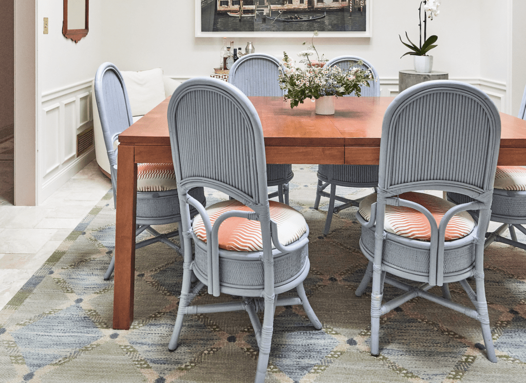
The irony is that I realized that while I was writing You have Use light blue in our home. It's just not in the all-encompassing application that I had originally envisioned. We painted our dining room chairs the color (Aleutians by Sherwin Williams) I have been drawn to her for a long time. We also pulled a similar blue hue in the dining room rug (shown in the top photo). As it turns out, the things you attract to have a way of showing up in your life. Stay tuned for more uses of this color in our home in the future! I have no doubt that she will appear again.

Kate is currently learning to play the ukulele, to the despair of her husband, children, and dogs. Follow her on Instagram at MustafaHosny Oh God, Amen.
Source link


0 Comments